 Have you ever reached about half way into your painting only to realise that the painting is not going well? That point where you have to scrape back the paint and start again? Or maybe abandon the painting altogether? I have done all of those many times. Yes it is part of the learning curve. But I did learn where the main problem was. The truth is that a painting's success is often determined before you even start painting. Plus you can tell withing fifteen to twenty minutes that it is not going to be a success. The lesson that I learned was that the preparation and start of the painting determined the painting's success. In most cases a good start meant that the painting would finish off well. Not every time, but the odds improve dramatically when you get the right start. This saves time, frustration, paint and gives you confidence to keep developing your skills. I have had the time over the years to work out a process that reduces the chance of messing up the painting. This does not mean a regimented system. Not at all! It simply means a process that follows logically while leaving you with the freedom to express yourself. I call this process The Perfect Start to Painting Success.
The process also covers how the initial stages of the painting can be completed. All of these elements work together to make the remainder of the painting simpler to accomplish. You do not spend your time trying to correct fundamental problems from the beginning stages.
Sound worth trying out? This process has been put into a mini-course that you can access for free. Simply click on the link for more information and enroll. The course will be emailed to you in a series of five lessons. Every two days you will receive video lessons that explain the process. You can then practice what you learn before the next lesson arrives. This is meant to be a fun introduction that will teach you the most important stage of your painting process. Suitable for beginners too. Please send me your comments or questions about the lessons and I will try to help you with your painting problems. Also share this with your artist friends if it could help them too. Click on the button below for more information. 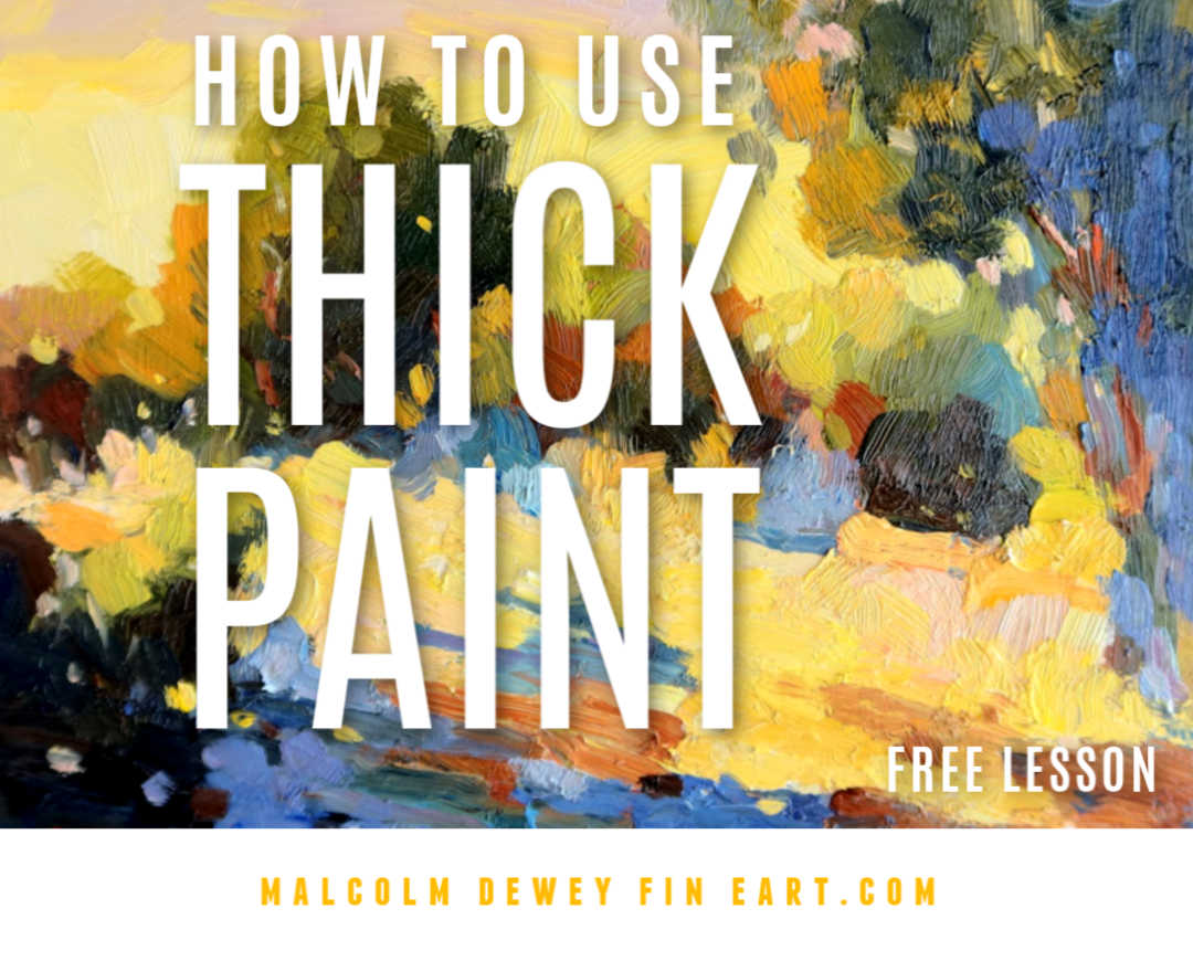
Recently an artist asked me why is using thick paint and textured brushwork desirable? How can one use this technique especially in large areas like the sky? The approach of working from thin to thicker paint, working fat over lean, usually starts with a thin wash of oil paint with a good measure of spirits mixed in. Perhaps a medium like liquin mixed in. Then a layer of thicker paint over that one to develop the shapes further. Until the painting is done. Acrylics is worked in similar fashion using water to dilute the paint. The ability to use thick paint is something you can take advantage of. It is an advantage because:
General Process:
If some areas look wrong, scrape the paint off. Go over the scraped area again. Muddy Paint? Have a look at these 12 Tips to Avoid Muddy Paint Expect to make mistakes and have paintings that look like an abstract from far off too. Laugh and try again. I promise you when it clicks you will love it! Watch a few videos of artists using the painterly approach. My top artist for this is Kevin Mapherson. For more adventurous painting look up Russian impressionist artists. They are wild and love the thick paint approach. Exciting work! Right - now your turn. Send me a pic of your work if you like. PS: Check out the video below for more tips. You can get more lessons on my course, Learn to Paint With Impact. Pin for later: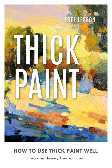
Painting is a beautiful challenge that is immensely rewarding. But when it goes wrong it does make one question whether we know how to paint at all. For this reason I dislike using the term beginner artist. We all feel like that when our limitations are most revealed.
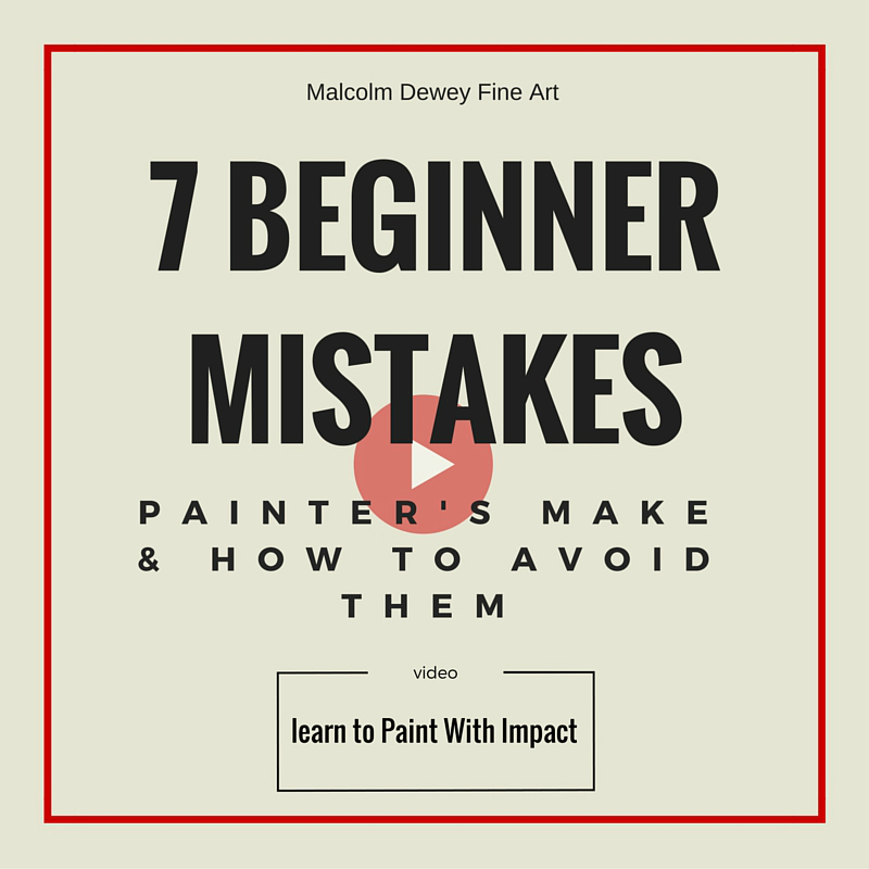
Then there are times when someone asks me for an opinion or a critique of their painting. This happens quite often and I am flatterd to help. After a time I have noticed a few common themes. I thought it would be helpful to list seven of these beginner errors. We all will experience them, but perhaps seeing them here may help you tackle them sooner. Here goes: 1. Paint What You Know: Concept is fine, but only if you feel it. Often a beginner paints something that is objectively beautiful. For example a Swiss Alpine scene or a Tuscan village. This despite never having been to either places. That would be me then. No wonder that the results are static, lifeless and weak. This is a common problem with beginners painting from stock photographs. Stock photos may look pretty, but there will not be any connection or understanding when you paint them. Familiarity with the subject will help immensely. A good way to to experience this would be to paint from life. Either outdoors for landscapes or to paint a sitter for a portrait. Another tip is to practice drawing. Especially more complex subjects where accuracy is critical. Drawing helps you observe carefully and ensure that the final result bears a strong likeness. 2. Not Undersanding Colour: Colour is complex. There is infinite variety of colour in nature. However an untrained eye will oversimplify the idea of colour. Grass is green and the sky is blue are examples of this. In reality grass colours may range from blue\green to oranges and reddish tints. The Sky may be ochre at the horizon, changing to pale greensih blue to a deeper blue. We must see these variations and be able to render them simply. Values, temperature, hue and saturation are ways artists try to deal with colour. How to begin learning to paint colour? Besides the theory of colour a practical way to learn is with the wooden block method. Get blocks painted red, yellow, blue and white. Place them together, outdoors in the sunlight, and observe the colours closely. Note the lights, darks, shadows. Note the influence of direct light, indirect light and reflections. Try mixing the colours with a palette knife. Paint the blocks on your canvas using a palette knife to keep the paint flat. This exercise will help train your eye to see colour. 3. Not Enough Value Change: Value refers to the degree of light and dark. Think of a black and white photographs to appreciate how values work. Colour also has value. For a powerful painting you need strong value change between shapes. It is the counter-change from light to dark that attracts the eye. This gives paintings oomph. Make sure that there is strong value contrast in your focal area. Plus either dark or light shapes must dominate the painting. Better results usually follow with dark areas dominating. (find out more about this technique in my free course) 4. Paint Too Thin: The only place for thin paint is at the beginning when shapes are being blocked in. Maybe also in the shadow areas. Too often beginners blend and smooth paint down until the entire surface is a uniform flatness. There is no texture other than the weave of the canvas showing through. Acrylic and oil paint can and should be used generously to vary the texture of the paint. Passages of thick paint or impasto add liveliness and delight the eye when viewed close up. Use the paint to full effect and be bold. A bristle brush or painting knife are better suited to this than the soft sable brush. 5. Brush Too Small: A small brush encourages fiddling. Little shapes and blending of paint. A large bristle brush (size 8 - 10 long flat) is versatile enough for small and large shapes without getting into the fiddling that small brushes encourage. Large shapes speak boldly. They make you look at shapes and not detail. All of this is critical training. Plus overall the painting looks looser and more impressionistic. Use the little brush to sign your name at the end. 6. Get CLoser: There is no point in having large expanses of sky or land on your canvas with nothing going on. The focal point is lost somewhere in this expanse. Rather crop into the action and show it boldly. Vary your viewpoint perhaps to add interest. 7. Canvas Too Big: This may be the issue with point 6 too. Painting a large canvas is irresistible when we start out painting. It suggests power and drama. Unfortunately it is also a lot of painting real estate to cover. Often with a small brush too. The fact is that a large canvas requires a subject that will do the canvas justice. This requires careful planning and preparation. If you are starting out the whole thing may end up being a bodge job. Rather use a small panel or canvas, but paint it generously. Go for thick paint and lavish attention on it. The result will have a glowing, juicy and delightful appearance. It will also be completed sooner, which is good for your confidence. Details are not necessary on smaller panels. This helps to train us to see shapes better. Conclusion There are of course many other things to learn. Painting is a lifelong pursuit, but practice does help. If you recognise any of these issues then you will be able to deal with them there and then. Your painting will develop quicker and your adventure will be a rewarding journey. If you would like to tackle these issues in more detail then take a look at my foundation course, Learn to Paint With Impact. Happy Painting.
Would any of your artist friends benefit from these tips? If so please share it.
|


AuthorMalcolm Dewey: Artist. Country: South Africa 
Archives
June 2024
Categories
All


FREE
|

 RSS Feed

|