Color mixing is intimidating. Do you struggle to get your painting colors to match the subject? Does your color look cold and muddy? In this article you will learn three great professional tips you can apply right now. Your color mixing will improve overnight. Two of these tips will cost you nothing as well. What's not to like!
Let's jump in and have a look at number one. Watch the Demo:
Number One: The Color Wheel
The first tips is to purchase a colour wheel. Now these do cost some money. But I'm going to make up for it with some inexpensive tips coming up. All right, here's the colour wheel that I recommend. This one is made by the Colour Wheel company. 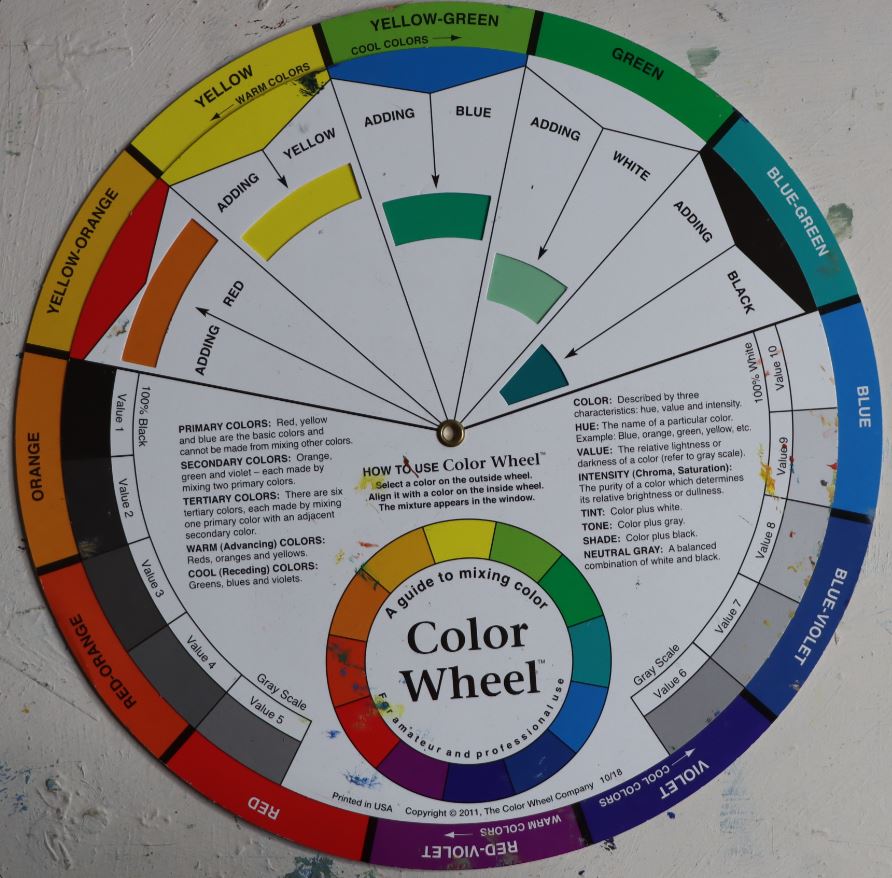
A Color Wheel
It's very simple to use, but also very effective. You get the usual colour layout of the primary colours and also the complementary colours, and then the in between. Yellow, green, yellow Orange, red, Violet. And what I like is that it really does teach you the warm range of colours and the cool range. And also at a glance how to get your complementary colours. And also these cut outs here as you scroll around will show you what happens when you add white to the colour and add red and yellow Orange and you'll get this warm Orange over there as well.
Plus, there is the basic value scale that can also help you learn a bit more about values. And on the back gives you the various potential colour recipes you could try. From split complementary to basic complementary to triadic schemes. Turn the wheel and you can see, for example, red and green complementary colors. A split complementary scheme like yellow green, blue green and red. This is a little more advanced as you get into colour mixing, but you'll have it on hand and you'll become aware of these colours a lot quicker. Find a colour wheel here. Number Two: A Colour Spotter Number two is the fun part of learning how to paint colour, and it's basically different kinds of ways to spot colour. Let's have a closer look to show you what I mean. So what is colour spotting? Well, colour spotting is simply a way to figure out what a particular colour is at a particular point on your subject. If you're working from a photograph, you want to be able to isolate the particular colour and make sure you're getting it correct. A quick way to do it is here, this is on a ruler and they usually have a hole over there. You can even drill a hole and place that over the spot you want to try and pick out and not be distracted. And I've got that sort of blue is shadow colour. That's a little more fiddly. Some artists use the hole on the painting knife and you can hold it up and close one eye, just squint at a particular point. That particularly useful, maybe for outdoor painting rather than in the studio. But there's another interesting way. You can create a colour spotter and get a piece of good paper card like this and just cut out a little square. 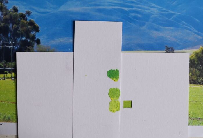
A Color Spotter
So now you've got a little square like that which you can place on your photograph. You can even place it over your monitor just to isolate a particular colour. A handy way to use this would be to teach yourself colour mixing and isolate a spot. There is that bright yellow and you can put a piece of card next to it. Then get your brush and start mixing that colour.
In the photo above I have isolated the bright yellow grass. Starting with a mix of cerulean blue and lemon yellow results in a color that is too green and cool. Warming it up with more yellow and a little white I can see the middle color is comparatively better than the first. The final mix has more yellow and a touch of white. I think this is just the right degree of vibrancy that I am looking for. After you've worked out the particular colour you can apply that to your canvas. Once you're finished with that, you may want to keep the colour cards. You may even want to make a note next to it of the recipe. What colours you used and build up your knowledge base of color mixing recipes.. As you learn your colour mixing, you will stop going to such details. But for more unusual colours, this could be an interesting way to isolate a colour and learn how to mix it very quickly. So that's a quick colour spotter that you can use with scraps. Unfortunately, mixing colour from a photograph has its problems. Photographs don't have accurate colour. Number Three: Mixing from Painting Studies Now, a real professional tip, especially for the plein air painters, is to take a plein air study they've done and then cover it with cling wrap. Ordinary plastic cling wrap. And then the plein air study will be used as the reference for a larger painting. You can test out your colours on the cling wrap itself. So I can put the colour spot on the painting, now protected by the cling wrap, and compare. Test the colour mixes gainst your plein air painting colours. If you squint a little and you can't see the colour , it seems to merge in, then you you've got it pretty darn accurate and you can repeat that. Another way to do this would be to get a clear plastic envelope. You can put in the reference if it's small enough or simply place the plastic on top and work on the same principle of mix and matching colours. Try different mixes and get an accurate colour representation. The plastic is easy to wipe clean and you haven't messed up your plein air study. So that's a very effective way to learn how to mix and test your colours. I hope these few tips are helpful to you, and you might want to incorporate a couple of them into your own learning process. If you do that, you will become familiar with colour mixing a lot quicker and start seeing colour accurately. That is the most important thing. To see colour like an artist takes constant practice. Observation and practical colour mixing must be combined regularly to achieve colour mixing confidence. Join the Painting Course |

AuthorMalcolm Dewey: Artist. Country: South Africa 
Archives
June 2024
Categories
All

FREE
|
 RSS Feed

|