|
Ask any professional artist what comes to mind with the words Daniel Smith they will most likely think of watercolor paints. For beginners and enthusiast artists the words Daniel Smith may be associated with expensive paints that they would not dream of spending money on.
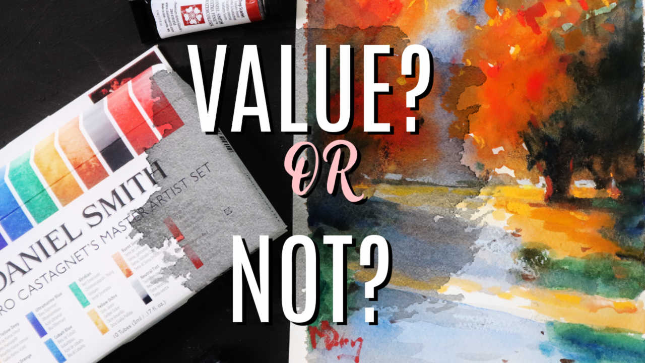
Are Daniel Smith watercolors as good as they say and are they worth the money? More importantly for beginners and enthusiast watercolor artists are Daniel Smith watercolors a wise choice? In this article I'm going to share my experience with Daniel Smith watercolors and give you a few painting demonstration videos to have a look at as well. I will also discuss the Daniel Smith watercolor dot charts and much more. Let us dive in .
Who is Daniel Smith?
This is a manufacturer of artist materials based in Seattle Washington in the United States. Since 1993 Daniel Smith continues to make premium artist materials including watercolors, oil paints and a variety of auxiliary materials. Daniel Smith has certainly become well known for its extra fine watercolors and the celebrity artists that endorse these watercolors. In fact I did purchase a master artist set named after none other than Alvaro Castagnett. Alvaro is one of the International “rockstar” watercolor artists and is famous for his flamboyant color and loose brush style. Having seen a number of Alvaro's painting demonstrations in the past I was curious about his palette of colors. I would now have a chance of trying out the Master’s palette! Other famous artists associated with Daniel Smith or Joseph Zbukvic, Jane Blundell and Jean Haines. The Alvaro Castagnet Approach I was excited to receive the master artist set as the approach of Alvaro Castagnet is something that I naturally aspire to. I also enjoy using the mop brush for my watercolor painting and I like to build up a painting with loose washes, strong values and a strong light effect. No, I do not call myself a master watercolorist at all, but I enjoy the medium and the challenge of painting a colorful watercolor. Not Wishy Washy I must mention that when I started painting decades ago watercolor was still associated with pastel transparent paintings that, to me, looked rather weak and uninteresting. As mentioned I prefer a strong value structure of lights and darks and a burst of color and strong light. None of these seem to be favoured by watercolor painters back then. It was always a very light and transparent effect. You would be forgiven for calling these wishy-washy watercolors. However in the past decade or so watercolor has taken on a new lease of life thanks to video and the spreading of new ideas. Led by artists like Castagnet, Zbukvic and Hermann Pekel watercolor is now a strong bold and colorful medium. The Watercolor Set I opened the box and went through the 10 tubes of colors. The 5 ml tubes look very small for someone who usually paints with oil paints and enjoys having a 60 ml tube of paint. But the strength of colors would make up for this, I hoped. You can also get 15ml tubes, however these do require some extra, ahem! … investment. This master artist set consists of Hansa yellow deep, Mayan orange, ultramarine blue, cobalt blue Viridian Yellow ochre Burnt Sienna light Neutral tint Deep Scarlett and Pyrrole red . The Painting Experience I set up 300g/140lbs Fabriano Artistico watercolor paper. Then set about doing a very loose composition of some trees with the morning light shining across a road and illuminating some trees. This is one of my favorites compositions as it includes strong light and dark and strong color. I painted a similar scene before in oils, but in that one green was the dominant color. In Alvaro’s palette the dominant colors are warm colors in the yellows, reds and earth tones followed by a few strong cools such as cobalt blue and viridian. And neutral tint is often used by Castagnet to set up a strong burst of red or orange. These are not colors typically used for green landscape foliage. These colors will however be ideal for a Mediterranean type of subject or strong warm landscape such as those found in the dryer regions of the world. Not a pallette I would use in an Irish landscape. Nevertheless as you will see in the painting demonstration, the painting developed its own life and turned into an Autumn scene with the strong warm colors. The painting also developed very quickly thanks to the strong pigments that made building layers of color quick and easy to do. Little Paint Required I was also amazed with the little amount of paint that I was required to generate strong color on the paper. I've barely used any paint at all to create the painting in the demonstration. This is good news if you have paid a lot of money for these Daniel Smith colors . Stand out colors such as Pyrrole red and Mayan orange and Cobalt blue make painting with these colors and absolute pleasure. Particular mention goes to the Pyrrole red, which was an absolute winner as far as I'm concerned. I will look for more subjects where I can use this incredible color. Are Daniel Smith Watercolors Really Good? So the question remains are these colors as good as many artists say? I can say that these Daniel Smith professional artist colors are significantly better than any student quality color you'll find. They are certainly as good as any other professional brand you will find too. It is important to remember that no manufacturer will have the best of every color. However for most of us Daniel Smith’s paints will be excellent. Are they worth the price? Without a doubt if you are confident with your painting then you will make good use of these paints. However, if you are struggling to learn watercolor and then using these premium colors would be a waste of money. There's simply no point in using expensive paints if you're still learning the basics of watercolor painting. Stick to a good quality student watercolor and learn as much as you can about values, composition and brush work. The management of your watercolor with a brush is possibly the most important technique that needs to be mastered with watercolors. Once your technique has been improved then take a look at picking a few colors in the Daniel Smith range. My suggestion is look for the colors that are going to enhance your painting. Warm colors like Pyrrole red or Mayan orange or the Hansa yellow will make a significant impact to your painting. You will notice that many watercolor painters work with grays and neutral tones and then come along with a strong accent color. The most important part of a watercolor still remains the highlights and the light effect. So the quality of your watercolor paper and brushwork is extremely important. Consequently a few neutral colors or the ability to mix these neutral tones using the primary colors will serve you far better. Then bring in your accent color to create the winning punch for your painting . How to select colors without wasting money? Fortunately there is an easier way to test out these colors before buying a tube of paint. You can get a range of Daniel Smith watercolor dot charts. You will see a demonstration below where I test out a range of colors from these charts. Simply apply a wet brush to the color dots and you will be amazed with the powerful color generated. In this way you can test out the colors and decide which are the Essential ones you need for your style of painting. Now the set of color charts is relatively cheap compared to a set of tube colors. You can also pick out a color chart which has colors that you are interested in as they come in various arrangements of color. So the color chart system is a useful way to test colors without hurting your wallet. You will also try colors that you would not normally take a chance on. Daniel Smith’s Innovative Range The many other Daniel Smith watercolors available and you can get them in half pans, watercolor sticks and of course in the tubes. My preference is for the tubes and I would suggest that you use an airtight watercolor palette in which to place the paints when you are doing your painting. It is also advisable to find the best quality watercolor paper you can and invest in one or two brushes that will make the application of color so much easier. You can have the best color paints but if you use the wrong brush you will be constantly fighting your paper and your painting will not benefit at all. What colors would I recommend? For my style of painting I think the neutral tint is very useful to get a good strong value arrangement. Also a good yellow such as the Hansa yellow or Lemon yellow. Ultramarine blue and burnt Sienna are also essential colors for strong darks. A strong red such as quinacridone red or alizarin crimson go a long way. Everything does depend on your preferred subject matter and if you do portraits with water colors then the earth tone range will be particularly important to you. So get a color chart of the colors that you prefer and for the subjects that you prefer and try them out. Watercolor and Pastel Course
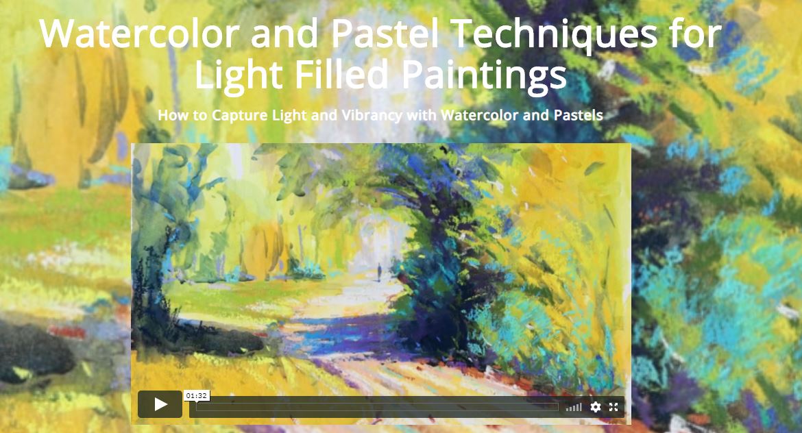
Do you want to try watercolors in a fun and light filled style? If so then this value packed course is exactly what you are looking for. Suitable for beginners and experienced artists.
Take a close look! Watch my three favorite watercolor masters create their magic! |
AuthorMalcolm Dewey: Artist. Country: South Africa Archives
June 2024
Categories
All
FREE
|
|






 RSS Feed
