• Home
  • Blog
  • Paintings for Sale
  • Painting Course
  • Top Painting Tips
    • Prints
  • Art Coaching
  • Resources
  • Free Download
  • Artist Statement
  • Podcast
  • Painting Podcast
  • Contact
  • Reference and Tutorial
Malcolm Dewey Fine Art
  • Home
  • Blog
  • Paintings for Sale
  • Painting Course
  • Top Painting Tips
    • Prints
  • Art Coaching
  • Resources
  • Free Download
  • Artist Statement
  • Podcast
  • Painting Podcast
  • Contact
  • Reference and Tutorial

How to Add More Color Into Your Paintings

14/3/2016

Comments

 
How to Add More Color into Your Paintings by M Dewey
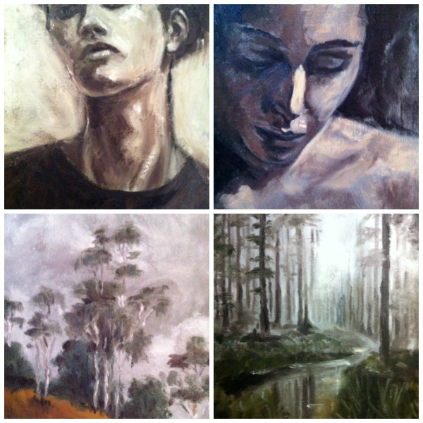
Recently I received a "solve my painting problem request" from Cleleste . She describes her problem as follows: "I would like to use more colour.  Most of my paintings are dull and somber- so unlike who I am. I can't manage to break away from that." Celeste kindly sent a few samples of her work. She also gave me permission to publish her photos. I am grateful to her, because this is a problem experienced by many other artists. Perhaps this post will help them too.
Picture
Celeste's "Low Colour" Examples
I am sure you will agree the artist's portrait drawing skills are very good. Also the monochrome color in the portraits has a moody appeal. However Celeste wants more vibrant color. The same goes for her landscapes.

Color is a beautiful mystery. A mystery that keeps an artist enthralled for a lifetime. How to capture the mood of a scene or the character in a portrait using a few pigments? Nature has almost infinite variety at her disposal. It is an unfair contest. But we try even so.

First off I must confess that color theory used to bore me as a beginner. Haul out the color wheel and my eyes would glaze over. I wanted to paint not learn about split-complementary color schemes.
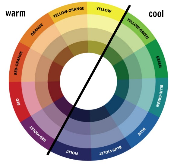
So it is with some trepidation that I do want to bring out the color wheel now. While our minds are still fresh. We cannot avoid it. But there are only a few things I want you to know on the color wheel:
Color Wheel Temperature
Color Temperature
  • Know the primary colors;
  • Know the secondary colors;
  • Know the complementary colors;
  • Note the difference between cool colors and warm colors (color temperature)
These four items will be important in your painting career. 
​
Tube Colors:
The paint stand at the art supplies store is a charming seductress. I have had my run-ins with her and it has cost me in the wallet. Not to mention the palette! Please start your color journey with a few colors. This will teach you critical lessons about color. It will also save you money. Essential colors are Cadmium red light, cadmium yellow lemon, ultramarine blue and titanium white. ​
Learn how to mix:
  • The secondary colors (violet, orange and green)
  • Earth colors. Burnt sienna and yellow ochre (red, yellow and ultramarine in various proportions) 
  • Add the secondary colors to the primary colors and see what happens. Add a touch of white to see whether the mix is warmer or cooler. We call these grays.
Mixing color and varying the tint with white produces many variations. Consider the paint swatches at the hardware store.  Practice these basics until you feel confident that you can mix the colors.

Why does my painting have lackluster color? There are many factors, but the most common are:
  • See the light: Light is fundamental to color. Light can accentuate color. Add drama. Light can also wash out color. Use light to your advantage by being conscious of the light.
  • Not mixing color Correctly. Often too many tube colors are used on the palette. This leads to colors looking unrealistic on the canvas. In turn this leads to frustration and overmixing. Too much white paint or tertiary colors and generally muddying up the color. 
  • Not Understanding Color Temperature: Look at the color wheel again, 
  • Not Seeing Color Relationships accurately or at all,
  • Using too much solvent: this loosens up the pigment and reduces color intensity. Thickness of paint also plays a factor here.
  • Not Using transparent paint against opaque paint
  • Muddy mixes - such as burnt umber getting the light warm hues

Let us look at each in turn:

Mixing: We have dealt with this one already. Use the limited number of colors. The colors will be more intense, clean and true to life. 

Color Temperature.  This will do wonders for your painting when you see these temperature variations.  I will sum up this complex topic like this. Color works best when you see relationships between colors. In this case is a color warmer or cooler than the color next to it? Ask yourself this question every time you look at the color. If cooler add a cool color like blue. If warmer add a warm color like red or yellow. Remember cooler does not mean making the color darker. Some darks are warm like burnt umber. 

Color Relationships: To take this idea further you must see color like an artist. That is cooler or warmer / lighter or darker than the color next to it. Ask yourself “Warmer-Cooler-Lighter-Darker?” Whatever the answer adjust accordingly. Then there are relationships based on the hue itself. Such as a primary alongside its complimentary. A yellow sun will look more intense against a violet sky for instance. 

Solvent. A clean brush is good. But you should try to avoid washing the brush too often during your painting. Far better to wipe the brush off with a tissue or rag. Solvents make the brush wet and they break down the intensity of the color. They also thin the paint texture. You lose some of oil paints natural buttery quality. 

Transparent and Opaque Paint.  Paint the early stages of the painting without white paint. Or very little of it. Avoid white paint in the shadow areas and other dark areas. Rather keep these areas transparent by mixing only pure colors and adjusting temperature. For example blue and burnt sienna make a strong dark. The sunny patches can have white paint added for opaque, thicker paint. This adds beautiful contrasts.

Memory: Only goes so far. The mind oversimplifies color. We miss so much true color from nature and end up with dull color. What we think is accurate color is guesswork at best. Look at nature or at a real person instead of a photo to see color accurately.

A few more notes. 
  • Color has temperature (warm and cool) and value (light and dark)
  • Color intensity is called saturation. It is most saturated in the tube. 
  • Mix Grays for true color variety: This is not mud. Grays make all the difference in nature. To get these tones mix primaries with complementary shades. Add white and see the warm or cool shades that result. These varieties can be everywhere in nature. Experiment to get your mixes accurate.
A final tip: See the real color by isolating the color note. To do this punch a hole in a card with a pencil. Hold up the card at arm’s length. Look through the hole with one eye. You will see a small part of the color isolated from those around it. That is the actual color you need to mix.
​
But what about Celeste's paintings? Following the above suggestions will add more color variety and impact. Here is my rough ideas on one of Celeste's landscape paintings:

Add More Color - Created with Haiku Deck, presentation software that inspires;
​What about portraits? Treat them in similar fashion. Paint from models where possible and keep the color strong. Brushwork bold. Shapes distinct.

There are many other factors such as brushwork, values and color schemes. It comes down to learning and practice. Also be willing to take risks. Be bold. Painting rewards artists who try new things. Have a look at my new course How to Add Light to Your Landscape Painting. Painting light involves using color and values better. This course will show you how to see these essential qualities. Have fun and put more color into it!

Want to share your painting experiences or tips? Please add them to the comments. You may be helping someone too.

Picture

Free Color Tips for Artists + Color Recipe Guide

Get two PDF guides for free. Improve your color mixing skill and enjoy your painting more.
Send the Books

Comments
    FREE Book
    Picture

    Color Tips for Artists:
    ​Free
    Picture

    Book Bundle Special
    See More
    Picture

    Author

    Malcolm Dewey: Artist. Country: South Africa
    View Portfolio:

    Picture

    Archives

    February 2023
    January 2023
    December 2022
    October 2022
    September 2022
    August 2022
    July 2022
    June 2022
    April 2022
    March 2022
    February 2022
    December 2021
    November 2021
    August 2021
    July 2021
    June 2021
    May 2021
    April 2021
    March 2021
    February 2021
    December 2020
    October 2020
    September 2020
    August 2020
    July 2020
    June 2020
    May 2020
    April 2020
    March 2020
    February 2020
    January 2020
    December 2019
    November 2019
    October 2019
    September 2019
    August 2019
    July 2019
    June 2019
    May 2019
    April 2019
    March 2019
    February 2019
    January 2019
    December 2018
    November 2018
    October 2018
    September 2018
    August 2018
    July 2018
    June 2018
    May 2018
    April 2018
    March 2018
    February 2018
    January 2018
    December 2017
    November 2017
    October 2017
    September 2017
    August 2017
    July 2017
    June 2017
    May 2017
    April 2017
    March 2017
    February 2017
    January 2017
    December 2016
    November 2016
    October 2016
    September 2016
    August 2016
    July 2016
    June 2016
    May 2016
    April 2016
    March 2016
    February 2016
    January 2016
    December 2015
    November 2015
    October 2015
    September 2015
    August 2015
    July 2015
    June 2015
    May 2015
    April 2015
    March 2015
    February 2015
    January 2015
    December 2014
    November 2014
    October 2014
    September 2014
    August 2014
    July 2014
    June 2014
    May 2014
    April 2014
    March 2014
    February 2014
    January 2014
    December 2013
    November 2013
    October 2013
    September 2013
    August 2013
    July 2013
    June 2013
    May 2013
    April 2013
    March 2013
    February 2013
    January 2013
    December 2012
    November 2012
    October 2012
    September 2012
    August 2012
    July 2012
    June 2012

    Categories

    All
    Art Business
    Artist Notes
    Books Worth Every Dime!
    Its An Artists Life
    Musings
    News
    Painting Course
    Painting Demonstration
    Painting Tips
    Podcasts
    Popular Posts Archive
    Reviews


    Picture

    Picture

    Visit Malcolm Dewey Fine Art's profile on Pinterest.

    FREE
    ​GUIDE

    Picture

    RSS Feed


    Picture

    Picture

Studio:  Troon Crescent, Port Alfred, South Africa
​Malcolm Dewey Fine Art is committed to top quality art, excellent educational material and having a great time! To back that up all works sold come with a 30 Day Money Back Guarantee. Simply return the work, undamaged, within 30 days. Returns at purchaser expense. All transaction are protected by third party bank-level encryption to keep your information safe. Plus your email address is safe. No spam - ever!

​Copyright 2010-2020: Malcolm Dewey Fine Art
​
Picture
30 Day Money Back
Picture
Secure Transactions
Picture
Picture
No Spam Ever!
Photos used under Creative Commons from maHidoodi, buggolo, Fabio Téllez
  • Home
  • Blog
  • Paintings for Sale
  • Painting Course
  • Top Painting Tips
    • Prints
  • Art Coaching
  • Resources
  • Free Download
  • Artist Statement
  • Podcast
  • Painting Podcast
  • Contact
  • Reference and Tutorial