|
Composition is critically important. Picking the right subject and then deciding what to do with it will make the difference between successful paintings and flops. So taking your time with assessing the subject and then deciding on the format cannot be wished away. In this article I will introduce you to the principles of design. Then demonstrate how I compose a painting from a photograph.
Let's begin.
The Composition Process (Video)
This video is an extract from my course The Complete Oil Painting Process Masterclass
Want to Listen to this Article?
What are the Principles of design in Painting Composition?
The artist guides the viewer's eye around the painting using composition or design. The eye of the viewer will then tend to linger over points of interest. You must arrange elements in the scene to produce the desired statement. The elements of composition design are line, shape, color, value, texture, form, and space. How you select these elements, arrange them and emphasise them will determine the overall design. So when it comes to painting, the composition is the arrangement of these elements within the picture space.
Practical Composition Example:
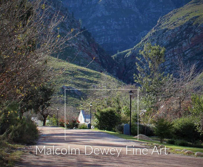
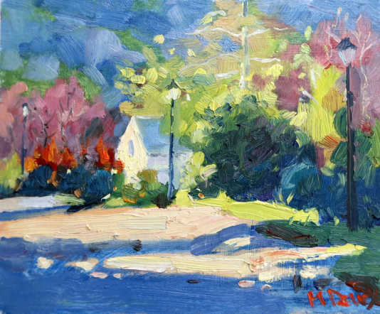
Ideally you will practice landscape composition outdoors using a viewfinder. However often you will work from a photograph in your studio. The reality today is that most artists use reference photos to guide or inspire the actual painting. In this demonstration, the reference photo that I'm working from is a big scene. But I do not have to accept the photograph as the be all and end all of a composition. Very often photographers look at a scene differently to a painter. You must therefore look at the photo critically and decide what to leave in and leave out. Sometimes the subject in a photograph is in the center and it looks fine. But you do that in a painting and it looks wrong. One side fighting with the other as the picture plane is divided in half. There is no dominant element to settle the eye. As a result the composition creates a scene of unease whereas I want a sense of balance. Ironically balance in a painting is best between large and small mass shapes, not equal mass shapes. This concept is known as asymmetry. For some reason we tend to prefer asymmetry in a painting. So take your time with composition and practice the design before you start painting. Composition Sketch: In the demonstration in the video I have first completed a notan study. Notan studies test compositions by looking for the big light and dark mass shapes. There should be one large dominant mass shape to anchor the scene. Next look at the format of the painting. Will it be a portrait, landscape, square or panorama? Consider also your viewpoint. When you're looking at a scene, sometimes an ordinary scene looks fantastic just by changing your viewpoint. Form above or lower down for instance. The Demonstration Painting I have selected a scene from a holiday in Greyton, Western Cape. Probably one of the nicest venues for a landscape artist. I took this photograph and when I got home I had to look at it and I thought, well, that would make a nice painting. Before jumping into the paints I had to decide what the painting was about? Why am I painting it and what do I want to say about the subject? I thought about the mountains, the trees, maybe the house. What I realized is that the most common mistake we make with photographs is that we take the photo of the scene, get home, and we paint everything that's within the border of that photograph. And as a result we forget what we need to do as a painter. A painter is not a camera. A painter has to bring an interpretation to a scene and convey something about it. The majesty of the mountains, the play of light on the trees and so on. And we're not all John Constable. As mere mortals, we will struggle to pull off a vast and complicated scene. What I encourage all artists to do with a photograph is to try and find as many compositions in the photograph as possible. Start off with the darks. Look for dark mass shapes. How can you emphasize the light using the dark shapes? It is the dark shapes that make the light stand out. I decided to do an intimate scene and focus on the house. I was intrigued with the dark shape of the large bush contrasting with the sun on the side of the house. Shadow Patterns If you still struggle with knowing where to begin with arranging the elements of design start with the shadow patterns. The shadows in the foreground are especially helpful. Always look for a shadow pattern. That is the basic rule to follow. Nice strong light against the shadows attracts the eye and creates a powerful focal point. Also the typical device of having a shadow in the foreground helps your viewer to step into the painting. Other composition elements like the streetlights with a little highlight, the nice rim lighting on the bushes with yellow greens. A spot of red in the bushes beyond the house. All of these are elements of shape, line color be arranged to best effect. Foreground, Middle ground and Back ground I have mentioned the foreground and middle ground already. Now the background. There is a lot of detail in the mountains. I would clearly need to simplify that. So I Dropped right down to reduce the amount of background as possible. Just enough is there to act as a backdrop without distracting from my focal point - the house. As you can see from the huge expanse of subject in the original photo, I now have this little postage stamp section and that is the subject. Simple and strong compositions work the best. If I perhaps wanted to turn this into another composition I could try a portrait format. Then I can make more of the mountains and the house. That could also be something very different. Atmospheric Perspective: This is another part of creating a background that aids your composition. Atmospheric perspective is a way of creating the illusion of distance and depth in a landscape painting. Aside from using lines and shapes to create the illusion of depth, atmospheric perspective relies more on using color and edges to create depth. Colors will get cooler and lighter over distance. Edges get softer and indistinct over distance. So the mountain scene in the background will be cooler and edges softer. Not harsh light and dark contrasts and nor bright or warm colors. Lines Lines, such as fence posts, light poles, sidewalks, telephone lines, ruts in dirt roads and so on can create an illusion for the viewer that the scene is moving off into the distance. Shapes get smaller and less distinct and the lines converge ultimately to the horizon. In this scene I am using the street lines, light poles and lines of the house to emphasize the depth into the scene. Simplicity is Strength The simpler the composition, the stronger it will be in most cases. Leave out unnecessary shapes and objects. In this scene there was an electrical box on the sidewalk area. A rather ugly shape that did not help the scene at all. So I left it out. The Demonstration Now watch the video to see these considerations coming into play. Let me know if this has helped you improve your composition from photos. Send Me the Full Training Right Now
|
AuthorMalcolm Dewey: Artist. Country: South Africa Archives
June 2024
Categories
All
FREE
|
|





 RSS Feed
