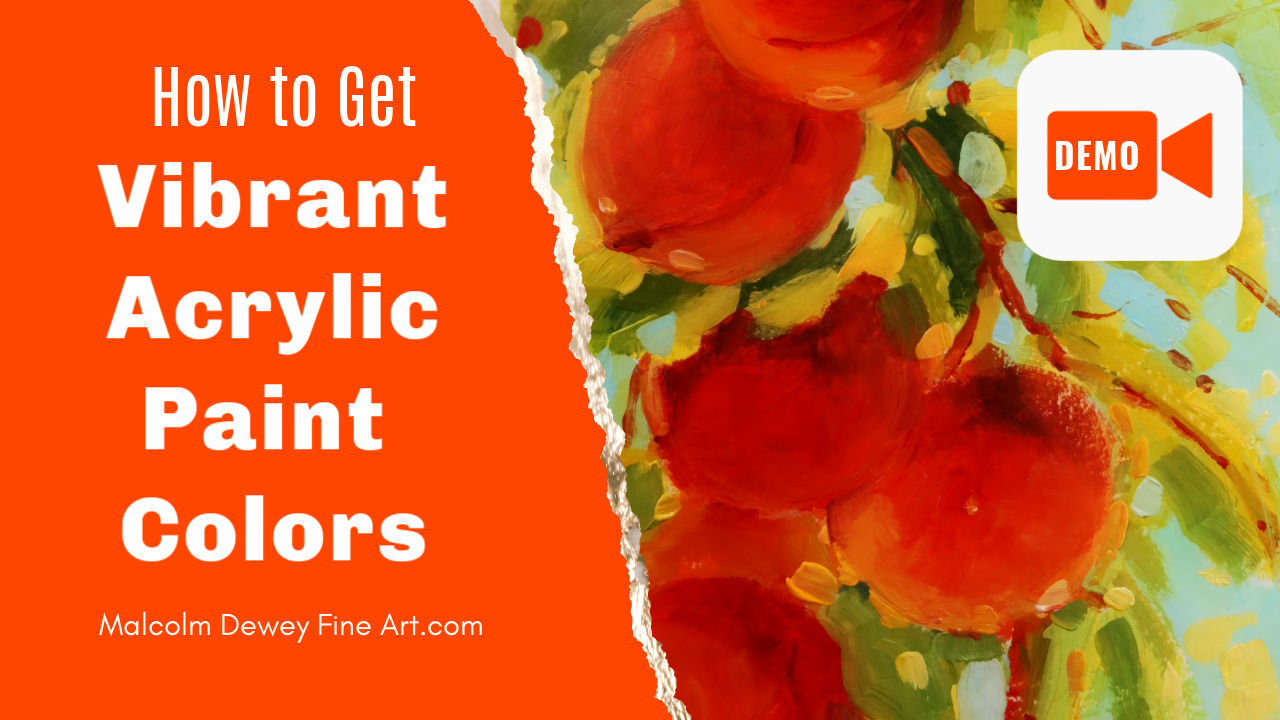
Avoid this common mistake to ensure that your acrylic colors are strong, rich and vibrant every time. Many beginner artists prefer to paint with acrylics for many reasons. I also started with acrylics although I mostly use oils today. After years of using oils and then painting with acrylics again I understood the biggest challenge with acrylics.
To be fair what I have discovered is not a problem with acrylics so much. In most cases it is one fundamental mistake that artists are doing that spoils the vibrancy of acrylic paint. In this article and video demonstration I'm going to dive into this issue and give you the solution to help you achieve vibrant acrylic color every time . Acrylic Painting for Beginners
The Nature of Acrylic Paint
For the most part I use the student grade acrylics for my demonstrations because that is what my students are also using. I use Amsterdam acrylics by Royal Talens. These are good quality acrylics, but are also popular with beginners and are affordable. However the two qualities that seem to catch out a lot of my students are:
How Students Use the Paint What a find happening is that many beginners add white paint to each colour mix. Of course white paint is probably the most popular colour used in every painting. But for some reason white paint is used often to make acrylics more opaque. It seems the transparency of acrylics encourages artists to get the paint as opaque as possible right away so that it covers easier. But in this approach lies the biggest problem. White acrylic paint immediately removes the saturation of the colour to the point where the colour is made cold and chalky. The end result is a painting that is far too desaturated. The colours are at best pastel in appearance. At worst the painting is cold and chalky looking. The solution In the demonstration video I make it clear that the transparency of acrylics is a strong point. Instead of starting off the painting by mixing white into your colours rather start off just using the colours. By layering the colours or mixing one colour into another it is very easy to build up strong rich colour. As you will see when I paint the first painting of the peaches I use white mixed into the colours and the result is a rather pastel looking painting. Although admittedly I did start using less white as I put on subsequent layers to try and rescue the colour the result was not as vibrant as it should be. In the second painting, however, I start off with using the colours alone and layer reds over yellows and oranges and so on. Even in the sky colour, which of necessity does have some white mixed in, I have added a little bit of yellow to warm it up. This gives the sky a more natural-looking colour. White paint is extremely cold and does not do any favours unless you add in more colour each time . Do I ever use white paint ? Yes, I certainly do bring in white paint especially for highlights and small light effects. You will notice the dots, dashes and dabs off light yellow and light blue that I bring into the painting. These highlights are important and add a real sparkle. In terms of the entire painting I use extremely little white paint. Colours are more transparent. You will notice that some colours do cover quite well, but the transparency of the underlying colour still plays apart. Transparency Helps You can create beautiful deep Shadows with magenta and ultramarine and burnt Sienna by simply layering these colours wet over dry to build up what is in effect a glazing of the shapes. The results look anything but like a cold pastel painting. Instead you end up with a deep, rich colour that resembles oil paint. How to Start the Painting To start off every painting I recommend that you do a brief sketch of the big shapes and then start adding the colours.You can work from dark to light or even from light and dark but you will find that finishing off with the light colours provides the best results. Moving from big shapes to smaller shapes and ending off finally with the little highlights here and there results in a very satisfying and vibrant painting . Mix Your Own Colours The second tip is to mix your colours to achieve strong natural colour. Especially colours like orange and green and violets are better when you mix them yourself. You'll find that using green to paint in acrylics ends up with a very opaque cold green in most cases. The Violet colours will not be transparent, but will be extremely opaque. But if you mix your own violet starting off with a transparent purple you can add in tiny amounts of white to create a more opaque violet. Most importantly you can control the degree of opaqueness. Become a Better Painter In the end this is about growing your confidence and abilities as an artist by taking control of your colour mixing and the degree of vibrancy and saturation that you get out of your colours. Only by experimenting and mixing your own colour will you achieve the confidence and ability to get the results that will make your painting stand apart. So please watch the demonstration and try out the techniques for yourself. Keep your white paint down to an absolute minimum and see how the vibrancy of your paintings improves. Compare them to your previous works and you'll notice a significant change. Please remember that this does not mean that your paintings have to be pure primary colours and excessively bright. You can use basic colour mixing to desaturate colour simply by working with a complementary colour such as a little bit of red to take out the vibrancy of a green. You can always add back a little bit of colour to get the saturation back up to an acceptable level. Always think colour first and then decide whether you need white paint. You'll find this approach will give you much better acrylic painting results in the long term. Your Next Steps If you want to explore your acrylic painting further I have a course called Acrylic Painting for Beginners and also an acrylic painting master course. Follow the links to get more information on these courses. I look forward to working with you in the future to improve your acrylic painting Start Your Acrylic Painting CoursePin for later ...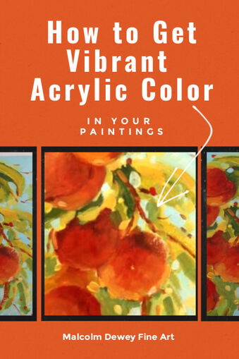
|

AuthorMalcolm Dewey: Artist. Country: South Africa 
Archives
June 2024
Categories
All

FREE
|

 RSS Feed


|