|
Is your painting’s success being frittered away with fiddly details? You may recognize the reference to Henry David Thoreau’s famous quote. “Our life is frittered away by detail”, he said. Instead we should simplify, simplify. I could not help thinking how on point that statement is for artists too. How often has a strong painting composition been overworked with little brush marks and excessive details.
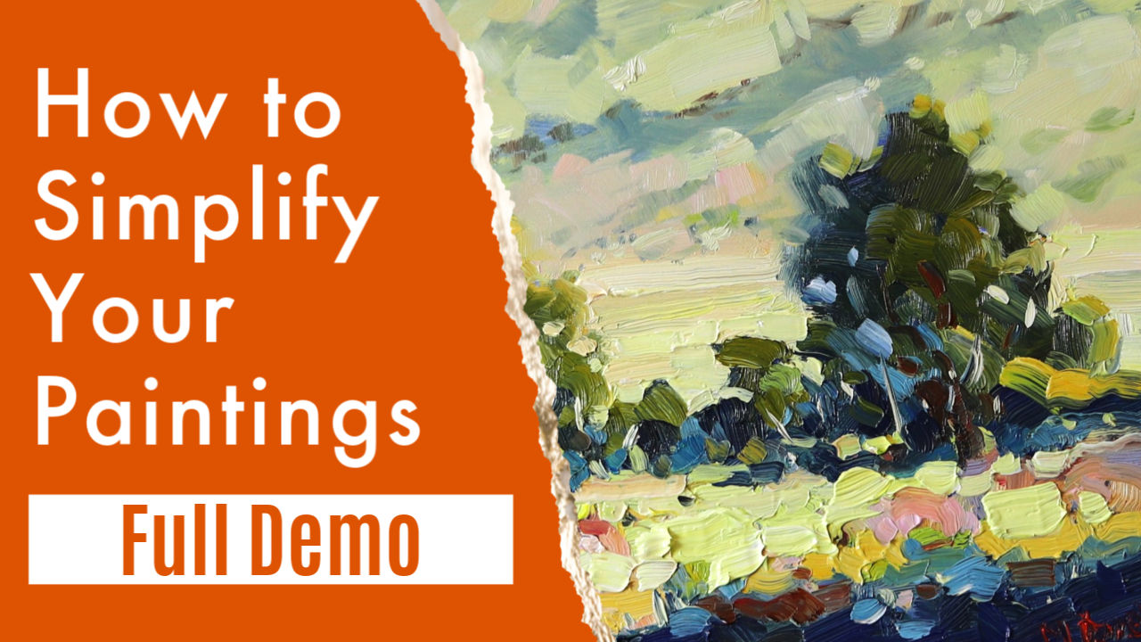
In this article and demonstration I am going to show you how to simplify a landscape into shapes and color. Take a look.
Paint with Your Eyes
Not literally of course. Every painting begins before a brush meets paint. It starts with seeing like an artist. That means looking for the mass shapes. Every scene out there is jam packed with details. More than we can comprehend, but let us focus on what you need to see. If you try to cram details into your painting you will overwork it. In fact you will probably get bored with the whole thing. Why? Because what attracted you to the scene cannot be communicated through many details crammed into a small format like the typical canvas. You may think you were attracted to the details, but not so. In most cases it was the light and the arrangement of big shapes that caught your eye. Imagine if a movie poster was a photo of a landscape. Nothing else. Then next to it is a typical movie poster with bold graphic colors, easy to read text and so on. Which will catch your eye first? If the artist has done a good job, the poster should stand out more.
The last two can be called middle value shapes. So we have a dark mass, a light mass and two middle value masses. Four big mass shapes makes up the typical landscape scene. Pretty amazing.
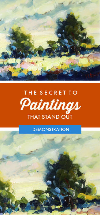
The Magic of Light and Dark Artists are brave. They are never afraid of the dark. Okay, I mean in painting terms so keep the night light on. Seriously though - it takes dark shapes in a painting to give pop to the light shapes. Without those dark shapes a painting can be rather bland. All vanilla and no choc-chips. I always suggest to my students to seek out the dark mass shapes first. Then switch on the lights with bright, warm color. When you are outdoors you may see, for example, beautiful light filtering through trees and illuminating the surface below. You naturally want to paint the light in that scene. But if you fly in with lots of white paint you will end up with a cool and chalky painting that is not enchanting like the natural scene. Instead look for the dark mass shapes. Block those in first. Then add the shafts of light and spotlights on the surface. See the difference? Goldilocks Was Not a Painter When our porridge-eating-fan indulged in a little B and E she went for the oats that were just right. Not too hot and not too cold. In painting terms this could easily make for a boring painting. To improve your chances of a head-turning masterpiece you want some hot and cold color as well. Not just all one middling thing. We call this color temperature. It is a thing I talk about often, because it is important. What is warm and what is cold color depends on where you put it. Alizarin crimson next to red light will look cool. Place cobalt blue next to orange and the answer is self evident. Orange will look cozy and warm. But next to yellow? Not as much. By placing colors next to each other that are relatively warm and cool will create more visual interest. We respond to color in very distinct emotional terms. Use this natural instinct to get responses to your paintings. Color can be symbolic or can convey an idea about what is happening in a scene. A warm yellow light in a cool blue landscape suggests a welcoming and cozy fireside glow from the distant farmhouse. Amazing what two colors can evoke in our minds. Give a Complement These color combinations get added zip when complementary colors are side by side. But make sure one is more than the other. A touch violet makes a yellow mass shape look warmer still. How about an orange flag against a blue sky? This makes the sky seem more vibrant. The Demonstration Painting In this landscape painting I take a simple landscape scene and ignore all the details. Instead the subject is light. I use the dark mass shapes of bushes against the sunlit grass to show off the light. Then shapes of color in warm and cool hues give the painting vibrancy and energy. I also use plenty of thick paint in the foreground. I want to create texture. Big juicy brush marks to add delight to the viewer who venture closer to the painting. At least that is the intention. Use all the tools at your disposal is my motto! Above all I want you to see that a painting that simplifies details does not mean the painting loses anything. Instead it should free you to express yourself boldly. Let me know what you think. Please share the video and subscribe to my YouTube channel to be notified of future videos too. I will be most grateful! Get a head start:
Pin for later: |
AuthorMalcolm Dewey: Artist. Country: South Africa Archives
June 2024
Categories
All
FREE
|
|







 RSS Feed
