|
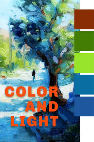
How do you get that color? Why did you use that color? These and similar questions about color are from artists who want to use more expressive color. More exciting color. You can still get an accurate impression of a scene with expressive color. This lesson will give you a few ideas to play with.
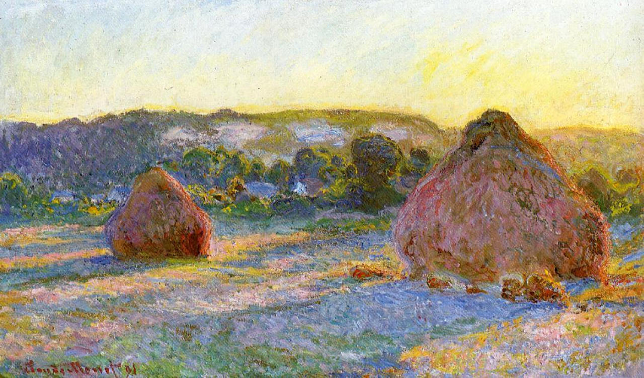
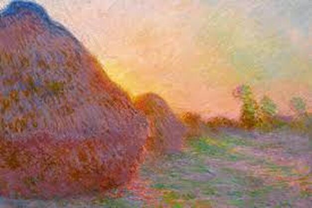
Let us explore color at the next level. But First If you are new to color basics please take a look at these tutorials on color fundamentals. They will help you a lot with the next stage of painting. Explore Different Hues I have often said that a limited palette of color will do more good than throwing a dozen or more tube colors onto your palette. That advice still holds true. But sometimes you can get into a rut. You have your pet palette colors and follow the same recipes. For example ultramarine blue and burnt sienna to make dark shadows. That is fine, but can become stale if you do not try other combinations. An example is to use cobalt blue instead of ultramarine blue. Cobalt blue can produce a high key blue for cool intense shadows. Play this off warm light and you get exciting combinations. If you light colors lean a little to orange the effect is heightened. Other ideas are to try quincridone red instead of cadmium red light. What does that do for your orange and violet mixes? Violet is Always Welcome Speaking of violet mixes. Try and find a place for warm and cool violet hues. Avoid using tube violet. Instead mix violets from your reds, blues and white to get harmonious color mixes. Whether in shadows as a cool or in indirect light for warmer hues, violet always adds a welcome spark of color in a landscape painting. Take a look at these two paintings by Claude Monet from his haystacks series. Pay particular attention to the shadow colors and how they change depending on the effect of light. It is in these shadows that overall painting gets it spark. The light works beautifully against the shadows colors.
Complementary Colors
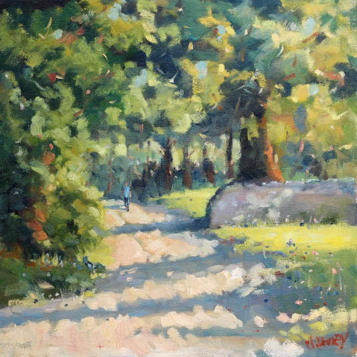
A basic working knowledge of complementary color combinations is essential. Get to know these by using them in your painting. One color to dominate and the complement to create the spark. Once you are familiar with these it is time to play with other combinations like split complementary schemes. Get out the color wheel as a reminder, but do not get too caught up in color theory. Let nature be your guide. Thick Paint Color gets a boost when paint is applied in thick layers. Also multiple layers. First the thick paint makes the most of the pigment. Then the texture plays with light. Use this natural phenomenon and your painting has another dimension as the light changes in the room. All these elements add up. Layers are vital to making colors work extra hard. All too often artists settle for one blended flat layer, becuase the drawing is okay. But what about the potential to have layers of color working too. One color on top of another color. Thick over thin. Lower colors showing through gaps. Scumbled brushwork of thick wet paint over dry color to create vibrant light effects. Use these techniques especially around the focal area or in the prominent light filled areas of your painting. What is holding you back? Watch the video: In the accompanying video I highlight these painting choices. The result is still an impression or reality but with added vibrancy. Explore color and light:
Pin for later ... |
AuthorMalcolm Dewey: Artist. Country: South Africa Archives
June 2024
Categories
All
FREE
|
|





 RSS Feed
