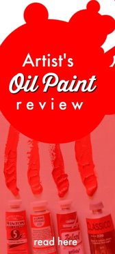
How do you choose your oil paints? What is important and what can you ignore? Are they all the same? Does the brand make any difference anyway? The truth is that when you decide to take up oil painting you are faced with a lot of materials and they can be expensive too. What do you need and what are nice to have, but not essential?
In this article I want to look at oil paints in particular. I will also review Michael Harding's Introductory Set of oil paints.
What Should You Spend on Oil Paints?
I want to get this out of the way at the start. There are many brands available these days. All promising beautiful results. As a beginner you will visit your local art supply store and naturally be directed to whatever they have in stock. Now what? First issue is price. If you have a small budget and you are not sure about the painting thing anyway then purchase student oils at the price you are comfortable with. There is no need to hurt your wallet. The last thing you want is to have this financial pressure hanging over you. The general rule is purchase the best you can comfortably afford. Move on from there. What Paint Should You Purchase? With the large variety of brands, types and colors it is a headache deciding. Despite promises by manufacturers their oil paints are not created equally. The old adage about getting what you pay for does apply to oil paints too. There are two broad categories. Student quality and Artist quality. The student quality ranges can vary a lot from abysmal to very good. How can you tell what is acceptable and what is poor? I tend to look up the manufacturer's website and have a look at their promises and any technical information. If they do not have a website and you cannot get any information this indicates a warning about quality. I have done a full student oil paint review before and you can read the results here. How does the Paint Handle? The real test begins when you squeeze out the paint onto your palette. What is your first impression? If linseed oil comes out first followed by the paint do not worry. This is usually a good sign. This means that there are not too many binders mixed into the paint to keep the oil bound to the pigment and other additives. Ideally you do not want binders at all. Just pigment and oil. The typical oil is linseed oil. You may also find safflower oil or walnut oil used in white paint. Linseed OIL can turn the white paint slightly yellow with time. Needless to say these oils indicate a good quality brand. Test with Your Palette Knife If the paint is dry and hard to work this may indicate that it is not fresh. I would return this to my stockist. You may even find dried paint film in the paint. Definitely return it. If the paint is consistent like toothpaste. Neither oily nor hard, but somewhere in between it is likely to have a lot of binders in it. This indicates a relatively cheap student paint. Okay to mess around with as a beginner, but you will likely move on to better in the future. This sort of paint will need a little medium mixed in to make it more buttery. I prefer oil paint to come out soft and buttery from the tube. A good shine from the oil and workable with the brush right away. You should not have to soften up oil paint with mediums. Color and Pigment In theory oil paint is very simple. A pigment that is ground up into a fine powder mixed with a carrier oil like linseed oil. In the old master artist days artists belonged to the apothecary guilds, because they had to grind and mix their own paint concoctions. Like a chemist. Some pigments were exotic and extremely expensive. Lapis luzuli rock, for example, was ground up to form ultramarine blue. As the name suggests the rock came from "over the sea". Afghanistan actually and imported to Italy to make blue during the Renaissance era. Ultramarine blue was so expensive that it was reserved to paint the Virgin Mary's robes. No surprise that most Renaissance masters used earthy and affordable colors. Today many pigments are synthetic. In some cases, however, original pigments are still used. The big question is what concentration of pigment is used in the paints? Student quality paint has less pigment and more binders. Artist quality paint has higher pigment concentration and less binders. Ideally no binders at all. Hue and Cry When you see a color described as a hue on the paint tube you know it is a synthetic version of the real thing. Cobalt blue hue or cadmium yellow hue all indicate something other than the real pigment. Of course you may be happy for this because genuine cobalt may necessitate a call to your bank manager first. A synthetic hue may not be a terrible compromise with a good brand. You must compare and experiment as your painting ability grows. Artist Quality Paint Has These Qualities: So what does a great paint have that others do not? In short ...
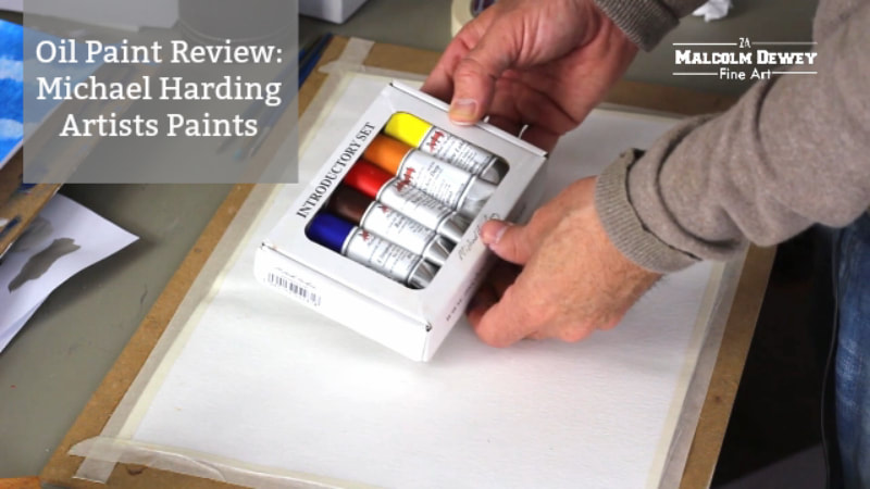
Michael Harding Handmade Artist's Paint Who is Michael Harding? Not just a name. Michael Harding is a UK artist who wanted to make top quality paints like the masters once did. You can find out more about him on his website. This hands on approach from a contemporary manufacturer is wonderful to come across in these modern times. I do covet fine paints. It is one of the critical ingredients to a painter's studio. Michael Harding has put together an introductory set of paints that cover the most important colors you need. The colors in the set include:
The paints arrive in a handy box and the tubes contain 40ml of paint. Of course the colors like scarlet lake and yellow lake cover for more expensive colors like cadmium red and cadmium yellow. However this is not to say the colors supplied disappoint. I have a video below where you can see the unboxing and the paints being tested. First Impressions on Michael Harding Paints As you can see from the video the paints have a wonderful consistency. Not pasty or too oily. In short they are perfectly buttery. Full marks so far then. 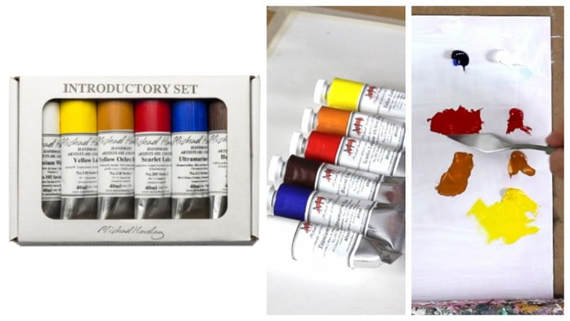
Pigment and Overall Brilliance
You may be surprised to note that even the titanium white was markedly better than a good student version. I do not use a lot of white in my mixes, but even so I found that this white does not make mixes chalky. A problem with cheaper versions. The ultramarine blue and burnt umber performed well too. But what you would expect. Strong pigment and excellent transparency. The scarlet lake is powerful. This paint will last a long time compared to the average student cadmium red. Not that such a comparison is fair since Michael Harding paints are reputed to be jam packed with top quality pigment. The yellow lake is also strong. As you can see in the demonstration video the mixes are intense. Yellow ochre tends to vary a lot between manufacturers. Whether you like this version or not may depend on what you are used to. Certainly it is also a strong color compared to student brands I have tested in the past. 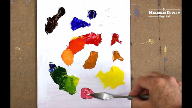
Exciting Colors in the Range Aside from the usual colors you would expect there are a selection of Old Master colors like Genuine Chinese Vermilion and Italian Green Umber. Also a selection of modern colors like Pthalo Green Lake. No doubt a massive color to manage very carefully. As with artist's paints each color belongs to various series categories. For example series one paints are cheapest and include the colors from this introductory set. The series go up to number 7 representing the dearest prices. The cadmiums and cobalts, for example, fall into series 5. Exciting colours like Afghan Lapis Lazuli and Genuine Chinese Vermilion fall into series 7. Value for Money? I have compared the Michael Harding paints to other artist brands of similar quality and find them to be very competitive. In some cases outperforming other popular brands quite substantially. It would be difficult to point at better paints. They are up there with the very best. The decision whether or not to use them must make sense for you and your painting goals. If you are painting for collectors who demand fine quality work at a price then you will be serving them well with these paints. The most important question remains though. What can these paints do for your painting? There is a reason master painters use paints like these. They are pushing the boundaries of color. The paints must stand up to these demands and by all accounts they do. Where pigment strength is critical then these paints will not disappoint. Where to find these paints? You can find various international stockists on the Michael Harding website. In South Africa you can contact the Italian Artshop in Cape Town who also stock Michael Harding paints. Watch the Paints in action:
|

AuthorMalcolm Dewey: Artist. Country: South Africa 
Archives
June 2024
Categories
All

FREE
|

 RSS Feed


|