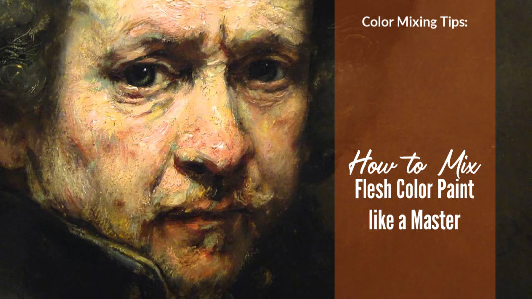
Color mixing remains a constant challenge for artists. Most of the questions that I get from students is how to mix certain colors. Of these many relate to mixing flesh colors. This is understandable when you consider the colors used by masters like Rembrandt. Look at the portrait of Rembrandt above. The variety of colors used are astonishing. A magnificent achievement. How can our paltry color mixes come close to this?
In this article I will give you the exact process that you can follow to get better at mixing flesh tones.
First You Must See
One of my abiding memories of early grade school was coloring in pictures with Crayola crayons. The array of colors was always a treat. How I envied the kids with the big box that came with a built-in sharpener. When I was given one of these for a present I was a happy young artist that’s for sure. But there were some annoying colors too. Top of the list was the flesh tone crayon. An insipid nothing color of light peach. Yuck. No real person has flesh color like that. I hated using that color so I ignored it and used proper colors. Browns and reds made better flesh colors. More expressive and punchier. Maybe I had started to take notice of what we actually looked like? Color Mixing with Paints Today we artists have as much freedom as we like to mix whatever colors we can. Pop art and modern expressive art has seen to that. But what if you want to paint a portrait and need to mix representational colors that look real? Colors that will not make your portrait sitter grumpy when they take a peek. (Think Lucien Freud’s portrait of Queen Elizabeth, for example). Fundamentally we have the primary colors and white to work with. Paint manufacturers have also given us many tube colors to choose from. Far more colors than Rembrandt had and this makes things more complicated than it should be. In fact let us simplify color mixing as much as possible. Isolate Color to Mix Accurately Back to the idea of seeing color like an artist. This means instead of staring at the subject wondering what the heck to do first, try to focus on color notes. In the picture below you can see how I have tried to isolate color notes from the Rembrandt portrait. Think of these notes as color swatches made up of: Hue (the name of the color) Value (the relative lightness or darkness) Saturation (how pure the color is) Color Temperature (relative warm / cool nature) See this article on color temperature as this is a critical issue to understand. Also this article on how to mix color confidently. 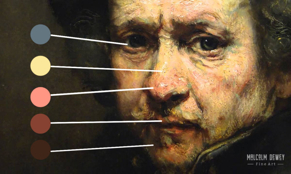
Try to see and isolate each color note
Classic Tools to Use: But a little more on isolating color. A classic technique is to squint your eyes slightly when looking at your subject. (Yay .. a free tool). Squinting removes many details. You tend to see light and dark shapes. So now you are seeing the value shapes to guide your color mixing. Next up is a color isolator. This high tech tool comprises a flat object (card for instance) with a hole about the width of a pencil punched through it. So not really high tech then Malcolm you big joker! Anyway hold the card out at arm’s length, close an eye and look at the color spot revealed through the hole. This is the color note to mix. So if you can identify the color note as, for example, reddish brown. Then compared to the colors around it is the note darker or lighter? Is it warmer or cooler? These answers will point to its saturation as well. For instance how close it is to its full saturation when it came out of the paint tube. The more white and other colors you mix into the note the more desaturated it becomes. What Colors to Use? To be honest I dislike formulas. So I will try to avoid the “two-parts-this-and-one-part-that” approach. Instead I want you to see the color notes, assess them as described above and then find the color notes on your palette. I say “find” the notes, which means mixing them of course. But I like the idea of finding the color notes because they are there waiting for you to seek them out. Give us the colors Malcolm! Okay okay … The following are a good set to have: Burnt Sienna Ultramarine Blue Cerulean Blue Yellow Deep Yellow Lemon Red Light Alizarin Crimson Yellow Ochre Venetian Red (optional) Titanium White This amounts to a warm and cool of the main color groups. What about Burnt Umber? If you like, but I have bad experiences with Burnt Umber - especially if I get white mixed into it. But using it is up to you. How to Mix the Flesh Colors Watch the video below as a guide. I filmed this on the spur of the moment. Like a free flowing exercise of playing with color. Simply to see what skin tones I could come up with by playing around with colors, value and color temperature. I think you will agree that there is a ton of potential colors. This makes it critical that you see and isolate the color notes as described above. Mixing the notes is much simpler then. An important tip: Be careful of using too much white paint. When you add white you are cooling down the color a lot. Sure you lighten the value too, but you may be making it too cool at the same time. Do this too often and your entire painting gets a cool, chalky look. A way to avoid this is to always add a little color back after you have added white. This will keep the color stronger, warmer and richer. Your value will not be lost either. Another option is to see how much closer you get to the correct value by adding actual color. Then add a little white to adjust. Conclusion I hope this primer on color mixing has helped you to think about color mixing a little differently. Especially to help you with mixing flesh tones. Instead of a formula-based approach you will now be able to respond to what is actually there. The actual color note. Then mix it. No more nasty crayon flesh tones. Instead you can mix exciting colors like Rembrandt did with his portraits. That is an exciting idea, don’t you think? Download the Free PDF Guide:
Learn How to Paint
The fundamentals in an easy to follow workshop. Learn online anytime. Find out more about this comprehensive painting program.
Pin for later:
|

AuthorMalcolm Dewey: Artist. Country: South Africa 
Archives
June 2024
Categories
All


FREE
|
||
 RSS Feed


|